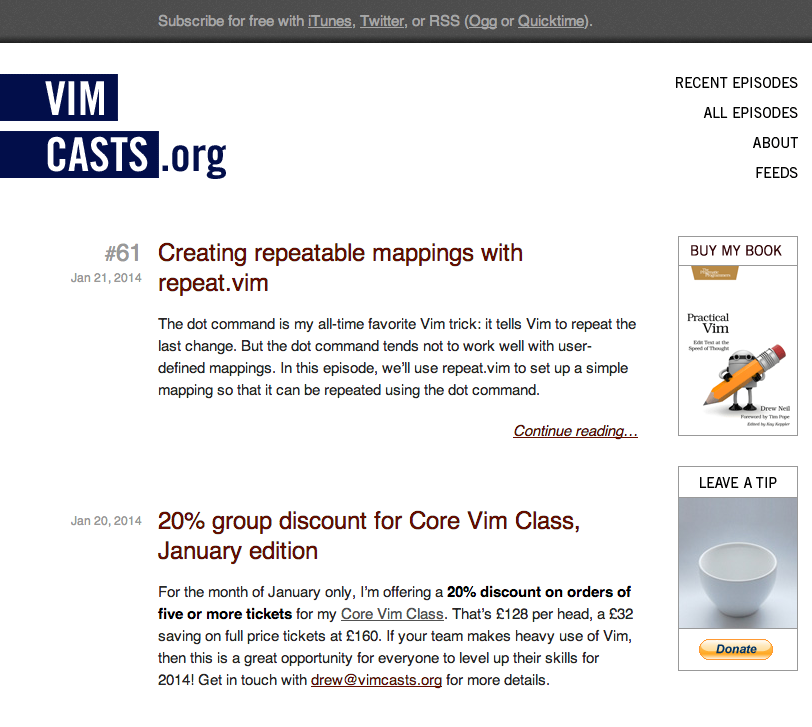
I’ve been working with Drew Neil to develop a content strategy for the popular developers’ site, Vimcasts. I’ve already blogged about how the user survey helped us to find out what people thought of Vimcasts and how Google Analytics helped us analyse people’s behaviour. Now it’s time to make Vimcasts’ content work harder. We’ll start with the homepage. This is how it looks at the moment (you can read a description here):

###Our Goal: Increase people’s engagement with the site Our research suggested that although Vimcasts has a committed fan base, there are a lot of people – almost a quarter of a million in a year – who are spending only a short amount of time on the site. People who completed the user survey also pointed out that Vimcasts could be more user-friendly in terms of having some kind of search or categories functionality.
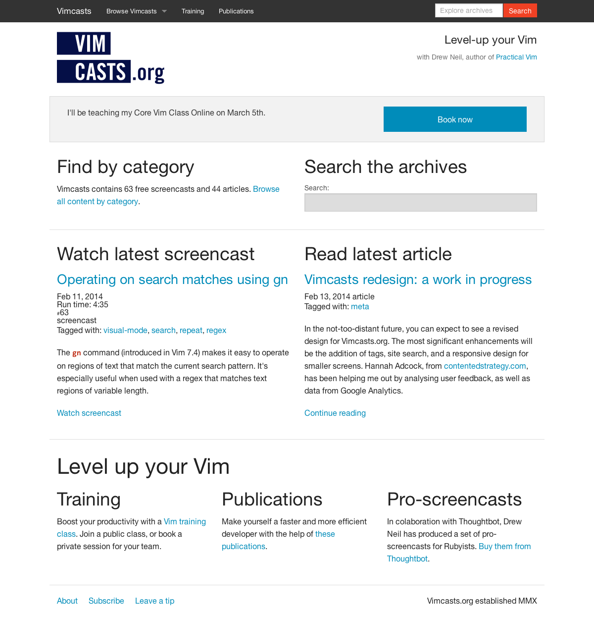
####What we did: added categories and search People can now search Vimcasts by category. This option should help people who land on the site and think: ‘I’m interested in Vim plugins or ‘I’d like to know more about registers: what is there?’. In addition, we’ve included information about how many screencasts and articles there are on the website – and this will be automatically updated – to give new visitors an idea of the breadth of Vimcasts.
We’ve also added site-wide search so that people who know what they are looking for can get that information – fast. This option should help people who land on the website and say: ‘What’s vspec?’ or ‘I like the sound of the Arglist for project-wide find and replace. I want to find out more!’
Using a content-first approach, we came up with this first iteration of the homepage:

####What we did: differentiated between articles and screencasts Sometimes you really feel like reading an article; sometimes you’d rather watch a screencasts. And if you don’t easily have the choice? Maybe you’ll just… go to another website instead. Fair enough. So we decided to differentiate between the two. As you can see above, homepage visitors now have the option of watching the latest screencast or reading the latest article. We’ve also included useful metadata, including the runtime of screencasts, so people can easily see if they have enough time/bandwidth.
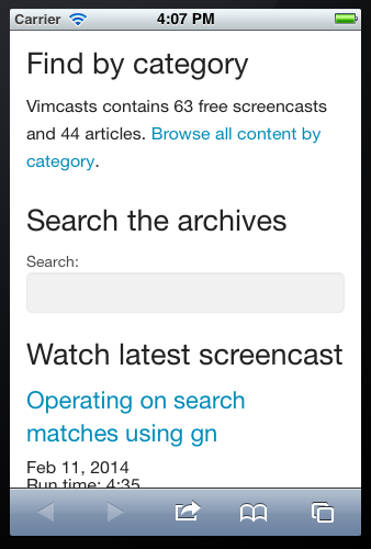
Given that Vimcasts is currently underperforming on mobile devices, we also wanted to make sure the redesigned site works well cross-channel. Here’s a screenshot of the search and category features on a mobile:

###Our Goal: Give more visibility to training, publications and pro-screencasts Our research suggested that although regular fans mainly knew about Drew’s professional work, new or less engaged visitors (who didn’t subscribe by RSS or follow Vimcasts on Twitter) weren’t so well informed.
####What we did: added calls to action on the homepage These calls to action are under the header ‘Level up your Vim’ and include: ‘Boost your productivity with a Vim training class. Join a public class, or book a private session for your team,’ ‘Make yourself a faster and more efficient developer with the help of these publications’ and ‘In collaboration (yep, spotted the typo) with Thoughtbot, Drew Neil has produced a set of pro-screencasts for Rubyists. Buy them from Thoughtbot.’ We will also add images/icons to each of these three content chunks to make them stand out more.
####What we did: added an advertising banner As you’ll see above, this banner currently advertises one of Drew’s training courses. As soon as that course date is past, the banner will display information about the next class. In fact, across the site we’ve used content modules to show time-sensitive information that is automatically updated. Drew can let people know what he’s up to without needing to manually publish content across a number of pages. It also means he’s less likely to have out of date and irrelevant content on the site.
###What’s next? I’ve blogged about the business case, practicalities, content implications, problems and disadvantages of taking a mobile first approach to the Vimcasts redesign.
###Need help working out how you can improve your digital content? Get in touch! Or you can find out more about how content strategy can help your business.
Content Strategy for Solopreneurs, Startups, Charities and Growing Businesses
This book will help you tackle 12 common business challenges including making sure you're reaching everyone who could be a customer, persuading people to buy from you and not a competitor, and how you can get your team to produce useful usable content. Read more about the ebook.
You'll learn
- How thinking strategically about your content will drive growth
- Practical tips on creating content strategy deliverables that will save you time and money
- How to create a content strategy for your company in 4 weeks
