Make your tech startup stand out using a message architecture
You want people to visit your site and immediately get a strong sense of who you are, what you do, what matters to you, and why they should choose you and not a competitor. When companies get it right, site visitors are left feeling clever, impressed and with a strong a desire to purchase your products. When companies get it wrong, visitors are left feeling confused, bored or slightly stupid, and are much more likely to leave or to proceed with caution. In this post, I’ll look at how developing a message architecture will help you successfully communicate key qualities about your company to potential customers.
Don’t look like every other tech startup
Some tech startup websites fail to successfully communicate what makes their company unique. They often hazily communicate that they are a technologically-minded and approachable kind of company. Apart from that, they don’t really stand out from each other in terms of design or content. I find myself forgetting who they are and what they do about 20 seconds after leaving their site. And this is a missed opportunity. With so many people competing for the attention of your customers, you can’t afford to under utilise what should give you a competitive advantage – your content.
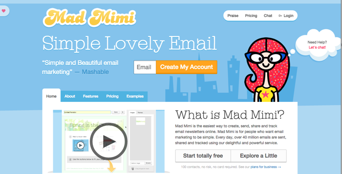
Take email service Mad Mimi for example. Their website immediately gives a sense of who they are, what they do, and why they are different through a clever use of design and content. Even if you don’t like their website, you will most likely remember it – and that offers Mad Mimi a distinct competitive advantage.

How you can make yourself stand out with content strategy
There are lots of ways to make your company stand out, but in this blog post I’m going to concentrate on developing a message architecture, because this tackles the issue of your startup’s identity at a fundamental level.
Content strategist Margot Bloomstein defines a message architecture as:
A hierarchy of communication goals; as a hierarchy, they’re attributes that appear in order of priority, typically in an outline.
All these ‘attributes’ are actionable, which means that you can communicate them through your content. For example, if one your attributes is that you’re ‘trusted’ you can show this through case studies, customer testimonials and customer logos, by clean, measured copy, by 404 pages that are useful rather than witty, and by support documents that are detailed, clearly laid out and informative.
By developing and implementing a message architecture across all your content, you’ll ensure that your customers quickly gain an impression of what matters to your company as they browse your site. Rather than being forgettable, you’ll begin to stand out because customers quickly understand who you are and why they should care.
A message architecture is different from brand values. The latter is more an internal document, while the former are about how you communicate with your target audience.
Developing a message architecture through card sorting
You can develop a message architecture in a number of ways, including card sorting, through a Venn diagram or through a big argument fuelled by too much coffee (not recommended).
I’m going to look in more detail at card sorting, which is my preferred option, because you get everyone in a room, thinking hard about what matters to the company, debating it with colleagues, and reaching some kind of consensus (this has always happened in my experience; sometimes it can take time though!).
You’ll need someone to act as a facilitator for the session, who will jump in with targeted questions at key moments (why did you choose x rather than y?; what does x mean to you?). I’d recommend bringing in someone external to your organisation who won’t let the session be derailed by internal politics. However, if you don’t want to do that choose someone who is good at listening, but who has the authority to gently lead the discussion in a productive direction.
How a message architecture helped one tech company stand out
Andreas Voniatis, founder of maths-driven digital agency Artios, talks about his experience:
Developing a message architecture gave me a lot of confidence that our new website was going to work. If there is no thinking involved in the first instance then copywriters and designers will have to make it up. You, as a business owner, should be responsible for ensuring that the necessary thinking process takes place before you bring in other people. After all, it affects everything on your website and beyond: the colour palette, the font, the images, the style of the words, everything to do with your marketing collateral. It’s unthinkable not to have this thinking in place before a major web project begins.
The card sorting exercise also made me question a lot of things: do we really want to be seen this way? How can we stand out from competitors? For example, nearly every agency says they are data-driven but through developing a message architecture we realised we were actually maths-driven. This is a point of differentiation from our competitors and has caught the attention of prospective customers.

Running a card sorting session
I’m indebted to Margot Bloomstein for much of this information below and would highly recommend her book Content Strategy at Work.
Right, let’s get going. In advance of your meeting, write down actionable words that may relate to your company and industry (plus a few obvious ringers) on pieces of card that are the same size and colour. Here are a few ideas:
| proactive | trusted | down-to-earth |
| practical | custom | innovative |
| customer-oriented | market-driven | professional |
| technological | visionary | tactical |
| responsive | consistent | savvy |
| friendly | high-quality | the thought leader |
| agile | approachable | welcoming |
| strategic | premium | cutting edge |
| national | detail oriented | accessible |
| responsive | in touch | assertive |
| progressive | modern | expensive |
| flexible | international | national |
| simple | serious | reliable |
| relationship-oriented | driven | experienced |
| smart | focused | structured |
| timely | pioneering | honest |
| pragmatic | collaborative | credible |
| rigorous | analytical | dynamic |
| connected | efficient | intelligent |
| engaging | versatile | fun |
Create your categories
Using larger piece of card that are a different colour write down these words:
- who we are
- who we’re not
- who we want to be
Get started
On the day, leave yourself about 1.5-2 hours for your card sorting session.
First, scatter the cards on a large table and start dividing them into the three categories mentioned above.
It doesn’t matter so much what the dictionary definition of a word is – it’s much more important what you think a word means. Discuss this with your colleagues. Some words can seem very similar in meaning but there will be subtle differences (for example, flexible and versatile).
This exercise is about working out how you want your tech company to be perceived by customers, so don’t get distracted by internal mission statements.

Get categorising
Get rid of all the cards in the ‘who we’re not’ category.
Work out what qualities from the ‘who we are’ category you want to take into the ‘who we want to be’ category. This might be most of them. Don’t worry! Get rid of the qualities you don’t want to take with you.
Start grouping the qualities in your ‘who we want to be’ category – some might seem fairly similar (for example, professional, experienced, credible, trusted).
Decide which quality (or qualities) in a group are the ones that you most want to communicate to your customers.
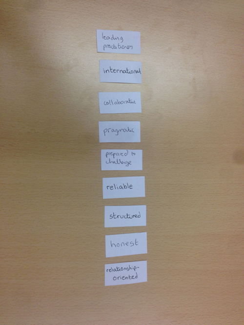
List the remaining qualities in order of priority – you should aim to have about 5-9 cards left in a vertical list.
Congratulations! You now have a message architecture
You now have an actionable message architecture. Take a photo. Pin the cards to your wall or stick them to your computer. Refer to them a lot!

What do you do now?
Now, you apply your message architecture to all your content. Either revisit existing content and tweak accordingly, or, if you’re starting from scratch, ensure your new content communicates your key messages.
This implementation stage can be challenging so you might want to bring in a strategy expert if you don’t have anyone suitable in-house.
Also, make sure your designer knows and supports your message architecture. There’s no point in your content producers going out of their way to show how approachable you are, if your designer favours a small paragraph text size and lots of images that take ages to load on mobile.
Concluding thoughts about developing a message architecture
By establishing a message architecture though a card sorting session, you’ll make sure that your startup stands out from the crowd and that customers know what makes you special. You’ll also discover who you are and why you’re different – something that isn’t always obvious when you’re head down building your MVP. Just make sure that your card sorting session is professionally conducted and taken (fairly) seriously by all involved. You don’t want it descending into a shouting match or a gossip session!
Content Strategy for Solopreneurs, Startups, Charities and Growing Businesses
This book will help you tackle 12 common business challenges including making sure you're reaching everyone who could be a customer, persuading people to buy from you and not a competitor, and how you can get your team to produce useful usable content. Read more about the ebook.
You'll learn
- How thinking strategically about your content will drive growth
- Practical tips on creating content strategy deliverables that will save you time and money
- How to create a content strategy for your company in 4 weeks
