We want to grow our startup faster and think content strategy will help
Content is why people come to your website. They want to complete a task, find information, be entertained, or a combination of all three. If you make these goals even remotely difficult for them then they’ll leave.
A customer doesn’t want to know everything about your company. She wants the content she needs, when she needs it.
So, a content strategy aimed specifically at startups can help your company grow faster by getting the attention of customers, answering their questions, and motivating them to take specific actions.
What you’ll learn in this blog post:
- How to use a core mission statement to nail down the fundamentals of your company and work out what content you should produce, who it’s for and what’s the end result
- Why providing a consistently good experience across all your content has a direct impact on your conversion rate
- How you can improve often overlooked pages
- Why you should concentrate on user flow through your website and app, and how you can do this
Why it matters:
- Poor or inappropriate content will lose you the attention and trust of your audience
- Mediocre content, with poor information architecture, will fail to convert browsers to customers
- Content that doesn’t make it obvious what a customer should do next leads to customer abandonment
- Inconsistent content – some good content and some poor – will confuse and frustrate customers
- Search engines penalise poor content so your search rankings will suffer
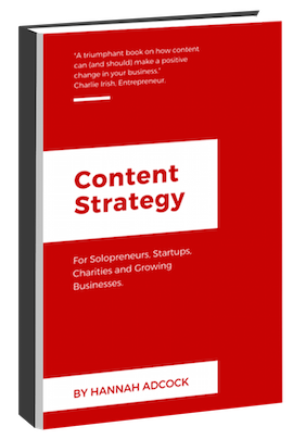
This post is an early extract from my book: Content strategy for Solopreneurs, Startups and Growing Businesses. Read more about how the book can help you drive growth, engagement and investment.
Get the basics sorted first
In this chapter I’ll give you an overview of how you can make sure you have content that drives growth and increases productivity, as well as how you can make the business case for content strategy.
Let’s begin by nailing down the fundamentals of your company. Sit down with your team and discuss what the purpose of your product or service is and what problem it solves. Even if you have been trading for three years this can be a valuable exercise. Make sure all your stakeholders are involved so you get everyone onboard now.
After this initial brain storming, you’re ready to craft a core content strategy statement. A core content strategy statement addresses issues such as:
- What content should we produce?
- Who is that content for?
- What’s the end result for us?
A tech startup that provides software for athletes in training might craft a statement like this one:
“Increase signups by producing detailed and technical content that will provide ambitious amateur athletes with answers to their training questions.”
Or a company selling GPS maps of the Australian outback might go for:
“Increase sales by producing knowledgeable and helpful location-based content that provides adventurous travellers with the motivation and means to navigate the outback.”
Provide a consistently good experience
Companies often spend time and money on a few bits of content (usually a homepage and a few other marketing pages) but don’t give much thought to the rest of their content and how their content links up.
As a result, the overall user experience for your product or service can be inconsistent. This can lose you the trust of customers.
Just think for a minute: you’ve come across some cool software and the marketing pages have been pretty persuasive. But you need to know if the software works for your specific setup. The features page doesn’t quite tell you but signposts the knowledge base.
So you head there only to find that it could have been written by a different company. One that employs robots rather than copywriters.

Don’t frustrate your customers with copy that reads like it was written by a robot. photo credit.
You try and read the knowledge base article, give up, and start wondering if maybe the product isn’t right for you after all. But you quite like it.
So you email customer service. And they say what a nice day it is and how happy they are to help. By which time you feel like screaming. Then they don’t really answer your question because it’s quite technical and you get the feeling they haven’t really understood what you’ve asked.
Result: you decide to buy another product because you get the feeling this company doesn’t really care about providing a great experience for their customers.
Providing a consistently good experience across your content is more important than having a few stand out pages of content and a lot of dross.
Neglected content often includes
Checkout pages
Pay pages that guide a customer through the process of giving you money.
Make sure that these are simple, easy to use and mobile-optimised. For example, if you are buying an ebook then you don’t want to be asked for your address: this is confusing and unnecessary. Avoid checkout providers who are cheap (or free) but offer a very poor user experience. You’ll end up losing money because of a poor customer conversion rate. This article I wrote for SendOwl offers some tips.
Knowledge base content
Help or support articles for new or potential customers.
Support content is a great way to reduce the cost per customer of customer support. You basically encourage your customers to ‘self-help’ rather than contact you every time they have a question. Support content also has SEO value (often for long-tail key words) and can be a good way to convert customers who want detail. Good customer support content might include:
- Title
- Table of contents
- Use cases for this feature
- Video walkthrough
- Walkthrough with screenshots
- Related content
Onboarding content
Emails and dashboard content that helps new customers find value in your product or service
Getting value from your product is easy if you built it, but make sure that it’s equally easy for your customers, particularly if they are on a free trial. Guide users towards useful actions that will benefit them. For example, I work with UXPin, a “full stack design platform” that helps me prototype websites, apps and so on. On my free trial I was encouraged to start a project when I logged in.

They also sent me a welcome email with a few more choices: Design from scratch, Import from Sketch & Photoshop, Get everyone on the same page and Start collaborative design. This gave me an idea of different use cases.
I created a project, enjoyed using the software – and signed up (which meant moving from a competitor).
For an insight into how other companies use onboarding have a look at this website.
Customer support emails, phone calls and chat
Reply to a question or query
Although it’s important that customers get support quickly, it’s essential they get useful support. There’s nothing more frustrating than spending 30 mins on the phone to someone (or spending half a day on email) and still not getting the answer you need.
Avoid contracting out support (especially choosing a company by price alone) unless you are 100% sure the support team get what you do, can genuinely help your customers and will work happily together with other team members. Otherwise they will cost you money in lost sales and inefficient company processes.

Even 24/7 phone support will go down badly with customers if your support team is not really very helpful. photo credit.
Less prestigious website pages
Anything that you need to click a few links to find
All content on your site should be valuable and serve a clear purpose. So don’t create poor content because it ‘doesn’t really matter’ or fail to revise content because ‘no one will notice’. All your content matters and customers (and search engines) will notice if you skimp on ‘less prestigious’ pages.
If you look at your analytics, you might also be surprised to see how high-performing some of your seemingly ‘less prestigious’ pages can be, perhaps because they have unexpected SEO value so lots of customers are landing on them or because they provide vital information that your customers need (but that you didn’t know they needed).
Microcopy and UI text
Labels on a form field, tiny pieces of instructional text, words on a button, field labels, error messages, confirmation text, even urls
Micrcopy is the unsung hero of your app or website. It can make the difference between a conversion and a confused customer. However, it can often get lost in the borderland between your content people, your user experience people and your design people. Who actually has responsibility for microcopy and UI? If no one takes responsibility then you can get all kinds of inconsistencies.

This website tries to pre-empt your concerns about security and what happens next using microcopy
As well as being useful, microcopy can also differentiate you from competitors. One aspect I really like about video conferencing company appear.in, aside from ease of use, is that they have brilliant generated names for chat rooms. Not only do these make me smile but they often provide a great way to break the ice with new clients. Plus they are functional: ‘first-gerbil’ or ‘opulent yak’ is much easier to say and share than ‘1062728’.

Social proof
Customer stories, video, testimonial, interviews, and so on
When you’re just starting out or are small-scale then you don’t have a large proven customer base. So ‘social proof’ can be a powerful way to persuade potential users of the credibility of your company and product or service.
However, if you want to make the biggest impact with social proof, approach it strategically. This means:
-
Make sure the type of social proof you choose fits with your business – don’t just copy a competitor. Short word-only testimonials might not be as useful to you as a video case study, for example.
-
Make sure you get your tone right. If your company targets both men and women include social proof from both, for example.
-
Consider how you can extract the most possible value from any social proof assets. If you approach a customer about a short word-based testimonial why not also see if you can record a short video or podcast with them about how and why they use your product – what problem it solves for them? Then you have social proof for people already on your homepage as well as a video or podcast that can be shared on social media and funnel people to your website.
-
Make sure you think about when customers need to see social proof – just having one page of ‘customer stories’ might not be sufficient, if your customers want to see social proof on your homepage or features page, before they decide whether to move deeper into your site.
Internal documentation about processes
Any documents meant for company eyes only, ranging from what holidays people can take, over-time, expenses, and so on, to ‘how to’ documentation about your social media strategy, message architecture, branding information, and so on
This content is largely about saving your company time and money in terms of processes. Every internal query you have to answer about holidays or expenses, or how to use this piece of software, say, costs you money. So get your answers to these queries down in one place so you don’t have to keep repeating yourself.
Even if you only employ occasional freelancers, having good internal documentation will save you time and money. If you commission an illustrator to draw you a couple of animations they need guidance on your company messaging and visual branding. A virtual PA who helps you with organisational tasks needs to understand how your company works and what matters, so they know when to get your opinion on something and when to go with their own judgement.
Companies scaling quickly also need to extract information from the brains of a small team of people so it can benefit new team members (and the company as a whole). It isn’t fair to expect new members of the team to do marketing, social media, support, or whatever, as faultlessly as your initial team can. They need proper advice, guidelines and examples they can refer to - not a quick onboarding tour and job done.
Think about creating a wiki or perhaps a folder on a file sharing service like Dropbox for key team sections like: who we are & what we do, overall messaging, visual branding, social media, marketing, support, software, holidays, overtime & pay, and so on. However:
-
make sure that someone has overall responsible for creating and curating this resource otherwise it will end up as an outdated mess
-
consider what matters most to your company for internal documentation: privacy, a good search function, ability to share…. there are a lot of solutions on the market so a ‘must have’ list will help you winnow down the contenders
Support your customers (not your internal lobbyists)
You want all your content to work together to support and nudge customers through your sales funnel. This way what content you do have is supercharged and offers the best return possible for your investment.
However, there are a few reason why your content might hinder growth rather than drive it, including:
- you don’t understand who your customers are and what they need
- your feel pressured by team members/departments to create certain content
- you feel that websites should be arranged in a certain way (or the many people you consult have strong views on how a website should look, often opposing!)
- you have something really important to say about your business and that deserves top billing
Stand tall. You need to reject these pressures. Unless you give your customers what they need then your company – and every individual and team within it – is going to suffer.
So, think about your customers and think about how they need to journey through your content (and that includes social media, print content, phone calls, text messages, and so on). Then, and only then, will you start creating content that will drive growth.
Let’s look at a website that pays attention to what a customer needs rather than simply ‘broadcasting’ information about the company.
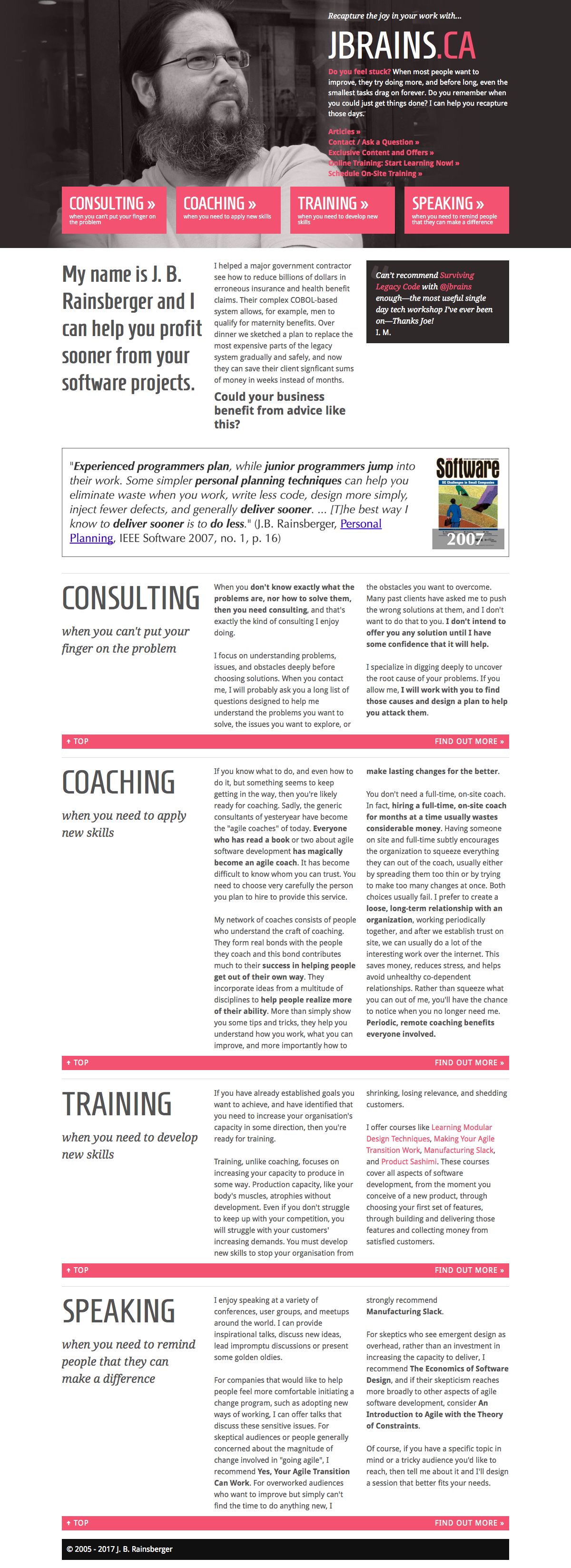
We’ll take the site for a test drive: I’m a CTO with responsibility for overseeing our company’s transition to an agile methodology. I’ve made a business case for getting some external training. Now I’m seeing what options are out there before pitching to our CEO.
I’ve landed on this page. There’s a great big button at the top that says ‘training: when you need to develop new skills’. Just what I wanted. I select this and am taken part way down the homepage to a section that tells me:
- whether we need training rather than coaching
- why training will benefit our company
- an example of courses offered
This section answers some of my questions. I’ve read enough that I want to find out more – so I select the handily placed ‘find out more’ link.
Now I’m on a training landing page. What have we here?
- More content about why training is helpful
- An ‘action’ plan that invites me to browse training courses by subject or structure. If I see something I like I can schedule a course without any more ado. If I think we need something more customised I can schedule an initial consultation
Useful. I browse by subject and spot the perfect course: “Making Your Agile Transition Work”. This landing page tells me:
- The course is right for you, if…
- What you will learn…
- What we will do
This is sounding great. Just what we need. The ‘schedule a course’ button is obvious and tempting. I go for it.
Now I see this:
You’d like to schedule some on-site training? Fantastic! I look forward to talking to you about working together. But first, I need to ask you a handful of questions in order to see how our schedules fit and to be able to answer (probably) the most urgent question you have: how much will it cost me?
Cool. I know our budget is realistic but I need to see the sums. I love that I’m not wasting time sending this guy loads of query emails as well. I answer all the questions: I’m led through them so there’s no problem. I particularly like question 12: What, if anything, would you like tell me that I haven’t asked you about?
I’m going to press ‘submit’. We are go!
The site author knows exactly what we need: I know exactly what they offer.
Job done.
I can’t believe how easy that was.
So, to recap:
- The site author has given a lot of thought to what his customers need and when. The homepage looks very simple (almost like a one-pager) but as you get deeper into the site you come across a lot of useful information. When you need it. And the author didn’t feel the need to link to all of it from the homepage!
- The site author hasn’t got bogged down in ‘web conventions’ – there is no top navigation, for example
- The site author has also give a lot of thought to what he needs (fewer exploratory and explanatory emails, phone calls and miscellaneous time wasting enquiries). So his web content is making him more productive.
- Although his content probably took a lot of work up front, in terms of researching his target audience and thinking strategically about what content they need when (i.e. how they will journey through his site), his hard work is paying dividends now. I bet his conversion rate is pretty good.
As a contrast, let’s have a quick look at a website that isn’t so committed to the concept of the user journey.

I’ll be the first to acknowledge that big corporations like this one have their work cut out: there are a lot of different customer groups potentially interested in what they are doing. However, a quick glance at the homepage gives me the impression that it has been carved up to satisfy the broadcast requirements of the company rather than to satisfy customers.
The homepage is heavy on links to PR releases. The financial team have managed to get seven clustered links included. Further down we have publications and videos where the marketing and social media team get to showcase their stuff. And we have a ‘traditional’ top and secondary navigation and an enormous footer menu.
Presumably that’s at least three or four teams in the company that are happy-ish. They have real estate on the homepage. The most important page right?
However, are customers happy? I wonder. Let’s take the site for a test drive. I’m a student studying biochemistry. I’m interested in a career in healthcare.
I know about the company so I google them and land on their homepage. My eyes are immediately drawn to the carousel. I try and read the content but then it disappears to be replaced by something else. Oh well. I look down the page to the left and see a list of press releases. Not to put too fine a point on it, but the titles are a bit boring. Not quite what I’m looking for anyway.
I glance to the right. Financial stuff. I don’t want that either. I look down again. I’m getting a bit fed up of all these links. I’m half tempted to watch the video. But the title isn’t very appealing. ‘A web series about diversity’. Has this been made for the regulators or something? Maybe I’m being too cynical. Maybe it is targeted at people like me. I don’t know.
I decide to scroll up again. Ah ha. There is a small link for ‘applicants’ that I missed before. I was too focused on the carousel. But I’m not an applicant. I’m just kind of interested. Gah. This is complicated. I hover over it. There’s a ‘get to know us’ link. Right, that sounds more like it.
I select this page and read the introductory text on this landing page. They are very keen to talk about themselves. I get the feeling they are not so focused on people like me. There’s not a single ‘you’ in sight. I’m not sure what to do next. There’s a main video but it is a grey box with a play symbol and no title. That’s not very helpful.
There are ‘facts and figures’ about the company that I can hardly read they are so small, off to the right. There’s a small video to the right that just looks like general advertising. Then I have some more choices in a menu to the left.
I guess I should watch the video. But wait. Maybe the ‘working at’ the company link might be more interesting. Gosh, this is more complicated than I expected. I’m a millennial. I’m used to the web being easy.
So, to recap:
- This site has got rather bogged down in a ‘let’s talk about us’ mentality that can make life difficult for readers
- Internal teams, I suspect, are quite keen to have their own real estate on the website and this means customer need is not always given priority
- With so many links on the homepage – and no real calls to action: big signposts that say to a customer ‘select this perfect link for you!’ – customers can get confused about what they should do next
- That sense of being led through a website in a useful and helpful way is absent – you’re left to make a lot of decisions based on sometimes not very helpful information
- And we’ve not even talked about the browsing experience on tablets or mobiles
These two website examples should give you a better understanding of what I mean when I say that you should try and give a customer the information they need when they need it. And if you get a ‘journey’ approach right, then your customer will have an easy and frictionless journey through your content, meaning:
- They find the information they need
- They even find information they didn’t know they needed (but that you wanted them to see)
- They feel smart and happy
- They might even consider buying from you - happy days!
Content strategy deliverables and takeaways in this post:
- Core content strategy statement
- Exploration of ‘neglected’ pages
- User journey explanation
Content Strategy for Solopreneurs, Startups, Charities and Growing Businesses
This book will help you tackle 12 common business challenges including making sure you're reaching everyone who could be a customer, persuading people to buy from you and not a competitor, and how you can get your team to produce useful usable content. Read more about the ebook.
You'll learn
- How thinking strategically about your content will drive growth
- Practical tips on creating content strategy deliverables that will save you time and money
- How to create a content strategy for your company in 4 weeks